So - let's start at the beginning. A Web Browser (like Internet Explorer, Netscape, Opera, etc) is a program which displays information on the screen of your monitor. It does so by interpreting codes and text contained in a file having the extension .htm (or .html or some few others which I shan't be bothering with here), and generically called an HTML file. This, by the way, stands for HyperText Markup Language. This file is nothing more than a plain and simple ASCII text (American Small Computer Information Interchange) file - so it can be written with nothing more complicated that Notepad or any similar text editor.
The browser starts reading the file, looks for the first instruction, and then acts according to a set of display rules it knows about, until it reaches the next instruction. (In fact, a modern one knows about several sets of instructions, each related to a particular version of the HTML language.)
Because it's quite important that a browser doesn't attempt to interpret any of the other files it may encounter on your computer or down the phone line, it will only deal with a file which begins with a tag announcing that the file actually contains HTML code. For our purposes, it's also useful to tell the browser which version of HTML you're writing in. This is because a five-year-old browser won't know about the latest versions of HTML, so may not display things in the same way as one released just last month. It's good practice to try to ensure that all your readers get the same result!
So - in this guide - all files begin with the tags:
<!DOCTYPE HTML PUBLIC "-//W3C//DTD HTML 3.2//EN">
<HTML>
I won't go into detail about the first one, except to point out that the 'HTML 3.2' part tells the browser that you're writing in version 3.2 of HTML (a pretty well-established standard to which almost all readers should have access). Also to say that any tag starting with <! will not be displayed and is only for information purposes. This is useful when you want to write notes to yourself in the file explaining what the next bit of code is supposed to be doing, or maybe to indicate the date when something was included in the page which needs to be removed, say, a month later.
The second tag is rather obvious - it says "From here on in we're talking HTML". This tag is mandatory - nothing will happen without it. There should also be a </HTML> at the end of the file - meaning that's the end of the HTML.
Next comes another mandatory tag:
<TITLE>your page's title</TITLE>
This is the one which places 'your page's title' in the title bar of the browser when it's displaying the file. Again, it has to be switched off with the / element (often called a 'closer'), so the browser know that what comes next is not part of the title. Tags are not case-sensitive, so <title> would do just as well - but I always type all my tags in upper case to make them easier to see in a page of code.
Next we sometimes find this non-mandatory tag:
<HEAD> and of course </HEAD>
... but they're not needed in most ordinary files and can be left out. I'll explain situations where a Header section is needed, later.
Next we always find this mandatory tag:
<BODY> and of course </BODY>
This is where the Body of the page is written - i.e. the main part of what you see on the screen. It's also where you can specify some overall display attributes for the whole file - like the font name, size, colour, background colour, background graphic, Hypertext link colours, etc.
<BODY BACKGROUND="graphics/mag_bak.jpg">
... is what I use on the main pages of the Musical Traditions magazine. Double quotes are supposed to enclose names of other files or attributes specified from within the HTML file. In practice, they appear not to be necessary ... as we're trying to write compact code there's no sense in including anything which isn't essential - every character has to be downloaded! Try putting them in if something doesn't work properly.
Obviously, the background colour or graphic is your decision as the page's creator - but avoid insisting that a reader has to do things your way unless it's important that s/he does. Thus I never specify the Font Face in the magazine apart from in the Discographies and a few other situations where a lot of text has to be displayed in a small space - then I use the tag:
<FONT FACE="Arial Narrow"> followed by </FONT> when it's no longer needed.
I also never specify the Hypertext link colours - suppose your reader is colour-blind and has set his/her browser to display these in colours s/he can recognise!
(This comment about the browser only dealing with ASCII characters is actually untrue - but it is easy to comprehend, and it works! Please don't think I'm being patronising if I say "Don't bother your pretty little head about it" - but the true explanation is so difficult and complicated that most of you would stop reading right now if I attempted it ... and even if you didn't, you'd probably come out at the other end saying "OK - let's just stick to ASCII characters for simplicity's sake.")
The browser will also ignore any more than one 'space' character at a time - I've never quite understood why, but it does. So if, like me, you want to have two spaces between sentences you have to create another one by writing one of HTML's 'special characters'. These are basically anything which is not a standard ASCII character - and they all work in the same way. They all start with a '&' and end with a ';' - so to get that double space I type between the full stop at the end of one sentence and the single ordinary space before the next one. That's a 'non-breaking space' (nbsp - get it?). If you need to leave a big space between two words for some reason, you can just type for as long as is needed. There will be more on 'special characters' later.
The browser will also ignore any more than one paragraph break <P> tag at a time - I've never quite understood why, but it does. If you need to leave more than one blank line you have to use multiple <BR> tags.
There are two ways in which you can effect the way <P> and <BR> tags work - this is by applying 'attributes' to them. An attribute is just a secondary instruction within the tag which effects the way it works. Many tags accept attributes – as you will soon see).
The paragraph tag <P> takes the ALIGN=left/right/center attribute - so you might type <P ALIGN=right> to align the following paragraph to the right margin instead of the usual (default) left. Notice that, while the Internet was an English invention (by Tim Berners-Lee), it was first utilised in America, and so it always uses US spellings - like <center>. Just use the normal <P> for the next paragraph to go back to left alignment, or close the tag with </P> if something other than a paragraph is to follow it.
The linebreak tag <BR> takes the CLEAR=left/right/all attribute - so you might type <BR CLEAR=right> to break the text until the right margin is clear of obstructions - a picture sitting there, for example. <BR CLEAR=all> breaks until both margins are clear.
Its quite likely that the first thing you might write on your page would be a heading of some sort - and you could always tell the browser to make it larger and emboldened, and to start the next line as a new paragraph, like this:
<P>
<FONT SIZE=5><B>Heading</B></FONT>
<P>
... but it's far simpler, and more compact, to use the built in Header tags, like this:
<H2>Heading</H2>
... which incorporate a paragraph tag above and below the Heading into the bargain. H1 is the biggest size and H4 is about as small as a heading ever needs to be. You can always specify the exact sized text with the Font Size tag, if required.
Font Sizes are a bit problematic because there can be so many variables. You've probably noticed that you can set your browser to display the page in five sizes from 'smallest' through to 'largest', or specific point sizes on older ones. The default size for text in an HTML file is 3 (about 10 point) but it's possible to set this to another number with the <BASEFONT SIZE=n> tag (n ranges from 1 to 7). This will override what your reader has set his/her browser to - not often a good idea. You can specify font size as being larger or smaller than the basefont size, i.e. <FONT SIZE=+3>, but that's no good if the reader's browser is already set to 'largest' as you can't get larger than that! The best thing is to experiment a bit - and try to avoid situations where the font size is too critical.
Your heading may need to be centred on the page - <CENTER><H2>Heading</H2></CENTER> will take care of that. If you'd like your Heading displayed in a colour other than black, then <FONT COLOR=red>Heading</FONT> will do it. Notice the US spelling of <COLOR>. There are a range of named colours (blue, green, yellow, etc), or they can be specified by their 24-bit hexadecimal RGB numbers in quotes and with a hash - <FONT COLOR="#FF0000"> is red, for example. There's a list of all of these at the end on this piece.
<BLOCKQUOTE>Indented text</BLOCKQUOTE>
... tag. Blockquote will indent everything by about 15mm from both margins. You can increase the indent size by 'nesting' several <BLOCKQUOTE> tags together, or you can 'nest' another one somewhere within the text of the first to produce a second level of indention. Don't forget you need to 'close' each one with </BLOCKQUOTE> tags.
Lists of several sorts are another sort of indented formatting which is easy to do. Three types of list are supported: Ordered Lists, using the <OL>List of items</OL> tags to produce an indented, numbered list; Unordered Lists, using the <UL>List of items</UL> tags to produce an indented, bulleted list; or Definition Lists, using the <DL>List of items</DL> tags to produce a list where the 'Term' is at the left margin and the 'Data' is on the next line and indented - like this:
This is the term being defined.
And this is the data for the definition of that term.
The Ordered and Unordered Lists both work in the same way - each 'list item' is preceded by (you guessed it) a <LI> tag, and just changing the OL to UL changes the number to bullets.
Definition Lists obviously need two different tags - unsurprisingly these are <DT> for the Definition Term and <DD> for the Definition Data - instead of the single <LI> tag. So, for the above example:
<DL>
<DT>This is the term being defined.
<DD>And this is the data for the definition of that term.
</DL>
Interestingly, you can also use the <LI> tag in ordinary text (i.e., outside a List) to produce a bulleted line. Similarly <UL>Text</UL> without any <LI> tags, will just left-indent the text - rather like the <BLOCKQUOTE> tag, above. This is good, as it's compact, but it could be confusing when you're reading through the code and trying to figure out where you made that mistake!
All of these lists can be 'nested' – this means that one (or more) can be placed within another to produce several different layers of effect … a bulleted list with one (or more) items having some numbered sub-items, for example. Add to this that all the tags I've described so far can be combined with each other in various ways to produce further subtleties of effect ... Experiment!
<!DOCTYPE HTML PUBLIC "-//W3C//DTD HTML 3.2//EN">
<HTML>
<TITLE>My Test Page</TITLE>
<BODY>
<H1>Heading</H1>
This is my test text.
<P>
Here's some more.
</BODY>
</HTML>
... and Save the file somewhere as 'test.htm'. Next start your browser and Open 'test.htm'. It should display:
Here's some more.
Now, click the browser's View menu and choose View Source - and Notepad will pop up with your HTML code displayed in it. Make any changes or additions, save the file as 'test.htm' again, go back to the browser and click the Refresh button - and your modified code will have produced a different display. Moving back and forth between browser and Notepad - making changes and seeing the results - is the essence of experimenting.
If you get fed up with all this hopping about, get yourself a simple HTML Editor - the freeware editor 'Arachnophilia' seems to be a very good example. These usually have two windows - you type the code in one and the results are displayed in the other automatically. They usually have some extra features like buttons to insert the commonest tags, and often display the tags in a different colour to the text, so it's easy to see which is which.
The next thing to say is that any graphic of greater than 72dpi (dots per inch) resolution is wasted on the Web, because your monitor only has 72 pixels (phosphor dots) per inch of screen. The 'Image' tag you will use to display the graphic will set how big the browser displays it, not the size of the graphic itself. So a 300dpi resolution scan of your favourite passport photo measuring 2" square will be fitted into the 2" square you've allocated for it - and so will a 72dpi one. The difference will be that the latter is just 144 pixels square (at total of 20,736 dots), while the former is 600 pixels square (at total of 360,000 dots) – almost 18 times bigger ... and 18 times slower to download. Actually it's worse than that because the browser then has to scale it to fit in your 2" square space - this takes more time, and it doesn't usually make a terribly good job of it. The end result being that your 'better' picture actually looks worse on your screen than the 'worse' one!
Should you get given, or scan in, a picture of high resolution, first save it in its native resolution in case you need to print it later (modern printers can handle 600dpi resolution graphics, and larger, with ease). Then make a 72dpi copy for use on your Web page.
To do all this graphic file manipulation you need a good graphics editor. I recommend PaintShop Pro unreservedly. You can get free copies of the earlier versions off most computer magazine cover discs - usually in the Essential Utilities section. As well as setting up PaintShop to output JPEGs at 72dpi you can also adjust their level of compression - more will produce a smaller file with lower quality, or vice versa. Experiment to get the results you're happy with.
<IMG SRC="graphics/image.jpg">
... if you have a file called image.jpg in the graphics directory (or folder, if you prefer that term). That will do it - but not very satisfactorily, because the browser has to download the image file first to find out how big it is, and then display it, before it can get on with displaying anything else. So first, let's tell it how big the image is (perhaps 200 x 350 pixels) - PaintShop will tell you its dimensions in pixels if you've set it up to measure in pixels. Thus a better tag, incorporating the size attributes, would be:
<IMG SRC="graphics/image.jpg" HEIGHT=200 WIDTH=350>
Your browser will now display all the text first, leaving a 200 x 350 space for the image, which it will download last. However, this tag will just put the picture in among the text where ever it happens to be. Better is to use the ALIGN attribute to say where you want it put, and you can also specify the space you want left around it (vertically and horizontally) for the text to wrap to. So try:
<IMG SRC="graphics/image.jpg" HEIGHT=200 WIDTH=350 ALIGN=right HSPACE=10 VSPACE=5>
Your picture will now be placed on the right of the page, with 10 pixels of horizontal space between it and the wrapped text at the side and 5 pixels of vertical space between it and the wrapped text above and below. Obviously, ALIGN will support 'left' as well as 'right' - and lots of other positionings, too (see the HTML Specification at the end of this piece).
The final useful thing you can specify with relation to an image is the text which a non-graphical browser will produce when it encounters an image. Is it really worth bothering with the few old farts who insist on using text-only browsers? Maybe not - but what about all the blind or partially sighted readers in the world? Readers with Braille or speech synthesis systems? This is where the <ALT> attribute is essential to give an Alternative to the picture.
<IMG SRC="graphics/image.jpg" ALT="text" HEIGHT=200 WIDTH=350 ALIGN=right VSPACE=5 HSPACE=10>
The 'text' above should be used to describe the picture in a way which is relevant to a non-sighted reader - this can require considerable thought!
A bonus is that the 'text' included here will also pop up when the cursor is placed over the image - as I do with the Footnotes to the recent articles in MT Magazine, or to give, say, courtesy citations for photographs. For this to work properly, the browser has to be re-set from its default setup. For reasons unknown, Microsoft set their Internet Explorer defaults to only displaying the first 256 characters of ALT text, so you need to reset the browser to 'Always expand ALT text for graphics'.
A little thought may bring the realisation that what a blind person will need to know is not always what a sighted reader needs to know. In practice this is not often a problem, but when it is, the Title attribute can help. This, just like the Alt attribute, is inserted into the tag as <TITLE="title text"> and, when present, this is what will pop up at the cursor, while the Alt text will be processed by a non-graphical, Braille or speech synthesis browser - the best of both worlds!
An example of the combined use of Title and Alt texts might be with a photo illustrating an article. The Title text might give the names of the people shown, and should cite the photographer or the source. The Alt text might subsume this information within a description of the scene which points out particular elements in the photo which are interesting or important - that the fiddle player is left handed, for example.
(2012 addition: since alternatives to IE are now becoming popular, my experiments with Chrome and Firefox reveal that neither display the ALT text! So, for today's users, use the TITLE attribute rather than ALT.)
Actually, the mechanism is very simple but, because the effects can be far-reaching, it is the area where most Web page problems can usually be found.
The tag to make a hypertext link incorporates two elements - an 'anchor' and a 'hypertext reference'. It looks like this:
<A HREF="pardon.htm">Walter Pardon</A>
Do I need to explain that <A>Walter Pardon</A> is the anchor and HREF="pardon.htm" is the hypertext reference? The reference is where the system needs to send you to, and the anchor is where it needs to return you to. In this example the words Walter Pardon appear like that - blue and underlined - within the normal black text. Clicking on them will load the file pardon.htm into the browser. Clicking the Back button will return you to the former file, scrolled to the position where the anchor was placed.
Sometimes it's appropriate to make the link from an image rather than a piece of text. In many 'modern' web pages there's so much 'eye candy' (needless images) that it's rare to find a single text link anywhere. These are the pages which initially appear as just a collection of empty boxes - which slowly fill with pictures (often, infuriatingly, pictures of words!), so that it's a minute or two before you're able to see that this wasn't a page which would be of use to you anyway! As you've come this far with me, I'll assume you hold these monsters in the same sort of disdain as I do.
If you do need to make an image the link element, you merely substitute an <IMG> tag (shown in red here) for the text in the previous example:
<A HREF="pardon.htm"><IMG SRC="graphics/wp_tiny.jpg" ALT="Small photo of Walter Pardon incorporating link to article on the singer." HEIGHT=80 WIDTH=60 ALIGN=right VSPACE=5 HSPACE=10></A>
Notice that the image is a special small one, as is appropriate for a link, and that the Alt text makes it clear to an non-graphical reader that the image is a link to another file, and what that file contains. No 'Title' text, saying that this picture is a link element, is normally necessary because such images wil be displayed with a blue border (like the blue underlining of the text link). The thickness of this border can be specified by adding a BORDER=n attribute to the <IMG> tag - 2 is the default, 0 will stop the border appearing at all.
As well as linking to another file, it's common to link to another point in the same file, particularly if it's a big one. So you'll often find a list of 'internal' links as a 'Contents' section at the start of a long article, each taking you instantly to a specific section of the article. In this case, the first word(s) of each relevant section will be given a NAME anchor tag to allow the link to be made, thus:
<A NAME="bampton">The</A> Bampton Morris dancers are first recorded ...
... and the link to that section about Bampton would be simply:
<A HREF="#bampton">Bampton Morris dancers</A>
Notice that the 'name' is preceded by a # in the link - this tells the browser to look for a name tag. In the previous example of the 'external' link to the Walter Pardon file, it would be very simple to take the reader to the specific section of that file which was relevant - thus:
<A HREF="pardon.htm#repertoire">Walter Pardon's repertoire</A>
... and so, when the Walter Pardon article was opened it would be automatically scrolled down to the start of the Repertoire section (provided that the beginning of that section had been 'named' as 'repertoire').
As well as linking to another file, it's common to link to a file on another Website altogether, via the Internet. This is done in exactly the same way - only the hypertext reference includes the remote site's address as well as the path to the file:
<A HREF=http://www.mustrad.org.uk/articles/pardon.htm>Walter Pardon article</A>
This one just directs the browser to the pardon.htm file in the articles directory of the Musical Traditions 'mustrad.org.uk' website.
(In case you're still at a loss to know exactly what the Word Wide Web is - it isn't! Well, it isn't an entity, anyway ... it's just a method of getting your computer to look at a file on somebody else's hard disc. The hard disc concerned is likely to be in a big computer in an ISP (Internet Service Provider)'s building somewhere, and the medium of connection is the phone wires. That http business is just short for hypertext transfer protocol and does nothing more than ensuring that the ISP's computer (which wouldn't necessarily be a PC or a MAC) and yours understand each other. This is, I'll admit, a vastly simplified explanation - but still correct in all the essentials.)
I said a moment ago that because the effects of hypertext links can be far-reaching, it is the area where most Web page problems can usually be found. None of the above examples are likely to cause too many headaches except in terms of getting the path to the file you want slightly wrong. Things like forgetting that the graphics directory is on a lower level of the directory tree than where you're actually calling it from - so graphics/image.jpg won't work, and you need to use ../graphics/image.jpg instead. (../ by the way, takes you back to the 'base' directory within which your various sub-directories, like graphics, exist).
It's also important to remember, with links to remote websites, that the Net runs on UNIX machines for the most part, and that their OS (unlike MSDOS) is case sensitive. If you type even a single letter in the wrong case in the reference you may not find the file at all. (It's also worth mentioning that I always use file names which conform to the ISO 9660 (or '8.3') format, which is restricted to no more than 8 alphanumeric characters or underscore for the file name, followed by a period, followed by a 3 character extension. And to avoid case problems, I only use lower case characters).
The area where links really can cause problems is when you're working with 'Frames' in your pages - but I'll leave that 'til a bit later.
One further simple item is frequently used on many pages; the line (or horizontal rule). The <HR> tag draws a thin horizontal line right across the page. It's most frequently used attributes are ALIGN=left/right/center and WIDTH=n. n can be expressed as a percentage of the page's width, or in pixels. The default alignment is center. So to make a horizontal rule in the middle of your page, one third of the page wide, you would code:
<HR WIDTH=33%>
The other attribute is SIZE=n. This governs the thickness of the line drawn, in pixels.
When you can do everything we've covered so far you'll be in a position to write the code for any standard Web page - you could code 90% of Musical Traditions Internet Magazine with no more than this! The remaining 10% is a little more difficult, and it's certainly where most of the problems of the Web lie. I'm talking about Tables and Frames ... let's look at Tables first.
What a program like FrontPage does is to present its user with a blank space and suggests that they 'design' a page in it as if they were using a DTP program. It then uses tables to attempt to reproduce this design in HTML code - and often makes a pretty good (or accurate) job of it. It's the fact that the user has no idea of what plain HTML can and can't do which causes the problems. Let's take a very simple example:
Suppose the novice 'designer' wants to produce a list and, knowing no better, decides to indent it 25mm from the left margin. The creator program has to put this list in a table because plain HTML only indents lists by about 15mm. In order to fulfil the 'strict' rules of HTML, it will specify the font size, face, colour, alignment, etc of every cell in the table and put in all the unnecessary closing tags for each cell and each line. The final result can be ten or more times larger than the plain list code would have been. If anyone had asked the novice "Would a 15mm indent be OK in this situation?" s/he'd probably have said "Oh, sure - no problem. Whatever's easiest for you."
Even a moderately complex page results in a maze of tables nested within other tables, within others - yards of redundant code all slowing down the file's downloading time. If you ever have to change a piece of information in it, you'll spend a quarter of an hour just finding where it's hidden.
So - in my opinion - tables are extremely useful, essential even, but should be kept as simple as possible and only used when they're absolutely needed. This is how they work.
<TABLE>
<TR><TD>cell 1<TD>cell 2
<TR><TD>cell 3<TD>cell 4
</TABLE>
... and produces a display which looks like this:
cell 1 cell 2
cell 3 cell 4
The <TABLE> tag allows lots of attributes which can change the way it looks and behaves. Three of the common ones are:
BORDER=n CELLSPACING=n CELLPADDING=n
BORDER=n places a line round the table and between its cells - 1 gives just a line, larger numbers give various widths of 3D style border, 0 removes the line altogether.
CELLSPACING=n adjusts the size of the gap between the cells and between them and the border.
CELLPADDING=n adjusts the size of the gap between the cell's contents and its edge.
Unfortunately, this last one effects the 'padding' all round the contents, so if you just want to leave some space before and after the text without increasing the gap between the rows you have to put some of those characters before and after the text. However, because all the table cells line up with each other vertically, you only need to do this on the longest line of text in the column - all the others will line up with it. Personally, I rarely use the padding or spacing attributes.
Far more useful is the WIDTH=n attribute. This can be specified as either a number of pixels or as a percentage of the total page width. In the 'old days' this was extremely easy to work with, but today - when some of your readers may still be using 14" monitors running at 640 x 480 resolution, while others are equipped with 21" screens at 1600 x 1200 - the results of specifying a table width of, say, 300 pixels, will be vastly different on the two setups. Just try to use sensible settings, and remember that you can't please all the people .........
My approach is to leave out the width on smaller tables, padding the longest lines with characters if need be, and to specify width as a percentage on bigger ones.
One further table attribute needs to be mentioned, and that's ALIGN=left/right/center. A table is aligned to the page's left margin by default, but this will change it.
Now - it's important to realise that each cell in a table is a completely independent entity and can have all its possible parameters specified independently. This is very good news for making your table look and behave exactly as you want. The bad news is that each cell has to have its non-default parameters specified independently - or most of them anyway. If, for example, you make a five-row, four-column table, and want the text in the cells in italics - then you have to put in the <I> and </I> tags for each of the 20 pieces of text!
Really, there are only two options - either accept that your tables have to be designed so that not too much formatting is required, or get to grips with 'Style Sheets' before you go much further. I take the former, easier, approach!
The second is VALIGN=top/middle/bottom which will effect the vertical alignment of the contents of all the cells in that row independently of the rest of the table. Middle is default. Changing it to 'top' is extremely useful when some cells contain more text than will fit on one line, resulting in wordwrap producing a second or multiple lines.
The third is BGCOLOR="colour" which will apply a particular background colour to all the cells in that row. Colours are specified as for the body tag, above.
<TD> actually needs some data to work on, so an apparently empty cell needs to contain at least a space character for it to appear at all. This is OK if you're not using a border, but if you have one turned on (and most tables do) it won't appear round this cell, so you need to use a instead. Here are some more commonly used attributes, and what they do:
NOWRAP - the algorithm which the browser uses to generate the table display attempts to produce a balanced result, and will wordwrap long lines to do so. This attribute prevents that happening, when necessary.
COLSPAN=n - will cause this cell to span n columns; useful for headings.
ROWSPAN=n - will cause this cell to span n rows; useful for side-headings or gutters.
WIDTH=n - will make this cell a specific width, or percentage of the whole. Watch out when used with a table whose width has also been specified as a percentage.
Remember that the data text (cell contents) can have all the normal text formatting attributes applied to it, as well as any of those above.
Another refinement to <TD> is that it can be made into a Table Header by changing it to <TH>. This displays the text bold and centred in the cell, and it doesn't have to be used only at the top of a table as a heading. Should you require any cell's contents to be bold and centred, just change that D to an H and save lots of formatting code!
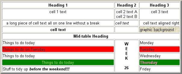
There is one further table element - the <CAPTION>text</CAPTION> tag, with the additional ALIGN=top/bottom attribute. This places your "text" centred above or below the table (above is default). Oddly, the text isn't emboldened, so you have to add bold tags if you want that.
... and here's the code which produced it:
<TABLE BORDER=5 WIDTH=75% ALIGN=center>
<TR><TH>Heading 1<TH>Heading 2<TH>Heading 3
<TR ALIGN=center VALIGN=top><TD>cell 1 text<TD>cell 2 text A<BR>cell 2 text B<TD>cell 3 text
<TR><TD NOWRAP> a long piece of cell text all on one line without a break <TD><I>cell text</I><TD ALIGN=right>cell text aligned right
<TR><TH>cell text<TD> <TD BACKGROUND="../graphics/mag_bak2.jpg">graphic background
<TR><TH COLSPAN=3> Mid-table Heading
<TR><TD>Things to do today<TH ROWSPAN=5 ALIGN=center>W<BR>E<BR>E<BR>K<BR><BR>26<TD>Monday
<TR BGCOLOR=red><TD>Things to do on Tuesday<TD>Tuesday
<TR><TD>Things to do today<TD>Wednesday
<TR BGCOLOR=green><TD ALIGN=center><FONT COLOR=yellow>Things to do today</FONT> <TD><FONT COLOR="#FF80C0"><B>Thursday</B></FONT>
<TR><TD>Stuff to tidy up <I><B>before the weekend!!!</B></I><TD>Friday
</TABLE>
I've coloured red the first instance of bits of code which produce the non-standard results in this example. Also, I often leave a blank line between each row like this to make it easier for me to understand. I hope you, too, will be able to figure out what's going on for each row - and how some attributes effect the whole table, some the row, and some just that one cell.
There are things you don't find in the books on a subject ... the fact that you can have a background graphic in a table cell, for example. Here's something else I've discovered over the years.
Many tables are used to produce multi-columned lists of things, where all the (say) four items in each row have to line up. You do this as in the example given above. But sometimes the columns don't need to line up, but just exist side by side - CD track lists, for example. You can imagine how much code would be needed to create a table to show all the tracks and all the performers on both discs of a double CD set with 30 or more tracks on each disc, if you used this method! But, provided that you don't feel the need to have a line between each track, you can do it very simply and compactly.
Just create a table with one row <TR> and four columns <TD>. In the first <TD> you list the track names for CD 1, each separated by a <BR> tag, so each one is on a new line. In the second <TD> you list the performers for CD 1, again separated by a <BR> tag. In the third and fourth <TD>s you repeat the procedure for CD 2. A rather more compact piece of code!
To sophisticate things a little, you might want to ALIGN=right the second and fourth columns of performers, and maybe put an empty column between the two CDs to separate them a bit. If you wanted, you could automatically number the tracks by making columns one and three ordered lists with the <OL> and <LI> tags instead of the <BR>s. At a guess, I suppose this version would be about 25% of the 'standard' one in file size, and would take about a tenth of the time to write!
If you want to make the performers' names italic, you can do it with two <I> tags instead of 60 or more in a 'standard' table layout (remember, each cell has to be formatted individually!) Don't want your table sitting right on the page margins, or centred either? OK then, indent it a bit with some <BLOCKQUOTE> tags.
There's very little limit to what you can do with plain HTML - all you need is some imagination and plenty of experimentation. If you're using a table to display text and/or graphics arranged in a certain way, you will probably have the border switched off. But it's a useful ploy to switch it on while you're creating the table - so you can see what's happening in each cell - and them switch it off at the end, when you've got everything woking as you require.
In this instance there are three files involved - the 'text', the 'notes', and the file which creates the framed display described above. In a typical example - say an article on Walter Pardon - the files might be pard_txt.htm, pard_not.htm and pardon.htm. It's important to realise that the file called pardon.htm has nothing about Walter Pardon in it at all ... it merely arranges the display of the two other which do. The complete code for it would look like this:
<!DOCTYPE HTML PUBLIC "-//W3C//DTD HTML 3.2//EN">
<HTML>
<TITLE>Walter Pardon - Frames Version</TITLE>
<FRAMESET ROWS="85%,*">
<FRAME SRC="pard_txt.htm">
<FRAME SRC="pard_not.htm">
</FRAMESET>
</HTML>
Let's look at it in detail. The first three and last lines are identical to any ordinary HTML file. Then, instead of the normal <BODY> tag, we have a <FRAMESET> tag, and its closing twin at the end of the file, which determine how the pages will be arranged. Between them are the <FRAME> tags which specify the source (SRC) of the page files to be displayed. Simple enough?
<FRAMESET> takes the attributes ROWS=n,n or COLS=n,n to indicate whether the pages are arranged vertically or horizontally (in rows or columns). The n values can be in pixels or precentages, and it's usual to leave the last one of the series as * (meaning anything) so that you don't have to change it when you make adjustments to the other(s).
In the example I've used ROWS="85%,*" to specify that the text of the article (pard_txt.htm) is displayed in the top 85% of the screen, leaving 15% for the footnotes (pard_not.htm) at the bottom. This is pretty well all that is needed for a simple implementation like this.
(It's also possible to set one Row or Column value and then define the remainder proportionally: <FRAMESET cols="1*, 250,3*"> This example creates three columns: the second has a fixed width of 250 pixels (useful, for example, to hold an image of a known size). The first receives 25% of the remaining space, and the third the 75% left over.)
In this instance, it's very simple to make one little file with just the headings information in it, and a bigger one with the table data in it. Put the two into a framed display similar to the one above and your problem's solved - the headings stay on screen while you scroll down the data rows.
Actually, it's a shame to have to do this at all, because HTML (version 4 and later) provides a method to do this in a table. Here the TABLE tag can have THEAD, TBODY and TFOOT tags within it, which will display the Header and Footer in fixed position with the Body scrollable between them. Sadly though, this is just one of several useful features of HTML which the browser manufacturers have not bothered to implement!
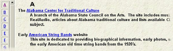
On the left is another very narrow page, the Navigation Bar, (linx_nav.htm) containing a vertical display of the 26 letters of the alphabet - each of which contains a hypertex link to the appropriate 'letter' section in the text file. First, let's have a look at a small section of each of these files. The Text file starts:
<!DOCTYPE HTML PUBLIC "-//W3C//DTD HTML 3.2//EN">
<HTML>
<TITLE>Links</TITLE>
<BODY BACKGROUND="graphics/mag_bak.jpg">
<DL>
<DD><A NAME="A"><FONT SIZE=+2><B>A</B></FONT></A>
<DT>The <A HREF="http://www.arts.state.al.us/actc/index-folkarts-actc.html"> Alabama Center for Traditional Culture</A>
<DD>A branch of the Alabama State Council on the Arts. The site includes music and narrative presentations in RealAudio, articles about Alabama traditional culture and lists available CDs and text publications on the subject.
<P>
<DT>Early <A HREF="http://www.1001tunes.webhost.fm/">American String Bands</A> website
<DD>This site is dedicated to providing biographical information, early photos, sample tunes, and discographies of the early American old time string bands from the 1920s.
<P>
.......... etc.
The important bits of code are shown in red. First you'll notice that the list is a Definition <DL> list: the term <DT> contains the actual hypertext link to the external Website (shown in red in these two examples); the data <DD> is some info about the site. From a 'frames' point of view, the thing to notice is that the larger and emboldened capital A has been 'named' as 'A'. This is the point in the file which the 'A' link in the navigation bar will connect to.
The start of the navigation bar file (linx_nav.htm) looks like this:
<!DOCTYPE HTML PUBLIC "-//W3C//DTD HTML 3.2//EN">
<HTML>
<TITLE>Links - Navigation Bar</TITLE>
<BODY BACKGROUND="graphics/mag_bak.jpg">
<TABLE WIDTH=30 BORDER=2 CELLPADDING=2 CELLSPACING=2>
<TR ALIGN=center><TD><A HREF="linx_txt.htm#A" TARGET=main-window><B>A</B></A>
<TR ALIGN=center><TD><A HREF="linx_txt.htm#B" TARGET=main-window><B>B</B></A>
<TR ALIGN=center><TD><A HREF="linx_txt.htm#C" TARGET=main-window><B>C</B></A>
........ etc.
This file contains a 26-row table with the border enabled and a bit of cell padding and spacing applied. The width is set to 30 pixels, not a percentage - this is to keep it more or less the same size (enough to accommodate one capital letter), even on a big, high resolution monitor. Each table row contains just one piece of table data - an emboldened capital letter enclosed by an anchored link tag <A HREF="linx_txt.htm#A" TARGET=main-window><B>A</B></A> to connect with the named section in the text file. Notice that, because each table cell is a separate entity, the bold tags have to be applied to each one. The attribute TARGET=main-window is to ensure that the file called by the links here is displayed in the 'main-window'. You'll see why in a moment.
OK then - here's the whole of the Website Links Page file (links.htm) which produces the page:
<!DOCTYPE HTML PUBLIC "-//W3C//DTD HTML 3.2//EN">
<HTML>
<HEAD>
<TITLE>Links Index</TITLE>
</HEAD>
<FRAMESET COLS="50,*" BORDER=0>
<FRAME SRC="linx_nav.htm" MARGINWIDTH=2 MARGINHEIGHT=2>
<FRAME SRC="linx_txt.htm" NAME="main-window">
</FRAMESET>
</HTML>
You'll see that we're using the COLS="50,*" attribute here as the pages are side by side, not above and below, and that the first column is set at 50 pixels - this is 30 for the navigation bar shown earlier and 20 more to accommodate its scroll bar. The BORDER=0 attribute ensures that there's no Windows standard grey border between the pages.
For the first frame - the navigation bar - I've specified a small margin to defeat the default 10 pixel one ... no sense in wasting screen space. In the second one - the main Links text file - I've given it the name 'main-window', referred to in the linx_nav.htm file as the TARGET for the links included there.
Here's part of the display produced by this file:
You can see the narrow navigation bar in the first column, together with its scroll bar, and the text file in column two - the main window. The A link in the navigation bar has been clicked (it's changed to the Windows standard purple of a Followed Link) and the A section of the text file has been scrolled to in the main window.
To avoid this happening, all those Home, Articles, Reviews, News, etc, links at the foot of any pages which will appear in a framed page must themselves be given a TARGET which is outside the frame. Such a link:
<A HREF="index.htm">Home Page</A> needs to be amended to:
<A HREF="index.htm" TARGET=_top>Home Page</A> to avoid this problem.
The TARGET=_top attribute (note the underscore character) forces the browser to start a brand new display for that file.
Note: Among these links at the foot of the page should be one to return the reader to the top of that page, which will look like this: <A HREF="#pagetop">Top of page</A> ... when the first word of the file has been given a 'pagetop' name tag. This link applies to the current page within the frame, and needs it to stay there - so make sure you don't go adding TARGET=_top to its link!
You then carefully set the width of the column in your frame document to accommodate that display. So far, so good. But you have your browser set to display in the 'medium' sized font; if your reader's is set to 'larger', then the ends of all the words in the nav-bar will be cropped!
I mentioned earlier those pages which initially appear as just "a collection of empty boxes - which slowly fill with pictures - often, infuriatingly, pictures of words!" This is the reason why nav-bars are often created out of 'buttons' made of pictures of words rather than text - a picture 80 pixels wide will always display 80 pixels wide, irrespective of how the reader's browser is set to display fonts, or what size/resolution monitor is uesd. Provided that you keep these 'button' pictures small and use JPEG graphics at 72dpi with plenty of compression, they don't take too long to load and provide a good solution to this problem.
<TABLE BORDER=3 WIDTH=60 CELLSPACING=0>
<TR><TD BGCOLOR="yellow" ALIGN=center><FONT FACE="Arial Narrow"><B>Preface</B></FONT>
</TABLE>
(the example width of 60 pixels should be adjusted to accommodate the size of words or phrases you're likely to be using)
View the file in your browser - is it OK? If so, press the 'Print Screen' key (next to Scroll Lock). Now open PaintShop and do 'Edit/Paste/As a New Image' ... a picture of the screen with your browser display in it appears as a graphic in PaintShop. Crop all but the area with the 'button' in it; zoom this to a size where you can easily crop it exactly to the edges of the button; Save As 'preface.jpg' in your graphics directory. Do the same with any other words you need for your nav-bar. If some of them have to be wider than the 60 pixels to accommodate a longer word you can Resize them to 60 with the 'maintain aspect ratio' deselected so as to retain the same height.
Now, when you go to code your nav-bar file, just use these graphics instead of the text. Thus:
<A HREF="preface.htm"
TARGET="main-window">
<IMG SRC="graphics/preface.jpg" WIDTH=60 HEIGHT=26
ALT="Link to Preface"
BORDER=0>
</A>
<BR>
<A HREF="intro.htm" TARGET="main-window"><IMG SRC="graphics/intro.jpg" WIDTH=60 HEIGHT=26 ALT="Link to Introduction" BORDER=0></A><BR>
<A HREF="ch1.htm" TARGET="main-window"><IMG SRC="graphics/ch1.jpg" WIDTH=60 HEIGHT=26 ALT="Link to Chapter 1" BORDER=0></A><BR>
……………… etc.
In this example (the first part arranged on separate lines for the sake of clarity) we have:
With the FRAME tag, there are a number of other attributes to try, of varying degrees of usefulness:
SCROLLING=yes/no/auto allows you to say whether this frame has a scroll bar (auto is default - ie. it appears when needed but not otherwise). This is only really useful when you have a vertical frame (like a nav-bar) for which the width of a scroll bar has been accounted for in the column size, as above. If this were a fairly short file there might be room for all of it on a large, high resolution monitor screen - in which case the scroll bar would disappear, leaving an unsightly gap between the frames displayed. In this case, set it to "yes".
NORESIZE will prevent the reader from being able to drag the margin between frames to a new position. This might be appropriate with a graphic button nav-bar, just to prevent any accidental re-sizing by the reader.
FRAMEBORDER=yes/no and BORDERCOLOR= can also be used with the FRAME tag, just as with the FRAMESET tag.
Many Websites have just one frame file as the Home Page (index.htm) displaying three pages at once: a fixed horizontal header frame with the site logo, welcome text, contact details, etc.; a vertical navigation bar on the left; and the site's content pages appearing in the remainder of the window. A very good system, particularly if the site isn't terribly 'text rich' ... AKA doesn't contain too much real information!
This arrangement involves nesting a FRAMESET containing two columns within another one containing two rows. Not too hazardous an undertaking - but attempting something more complex than this is a sure way to bring on a migraine!
The <HEAD> tag and its closer are optional. It can contain a number of elements, the most important of which (for our purposes) are the TITLE and META statements. As we have seen, the former can be used on its own, but the latter does need the HEAD statement to preceed it.
<HEAD>
<META name="keywords" content="music, song, traditional, folk">
This would be placed in the <HEAD> section of your Home Page (the file named index or home.htm or html) and would list the words or phrases, separated by commas, which you think Search Engine users might have entered if they wanted to find a site like yours. Bearing in mind that many search engines use the first 1000 words of text in your page to guide their searches, you might think that a META statement like that above is unnecessary in a well-designed page. This may be true, but there's often something on the site not mentioned directly on the home page, and any graphic buttons you may have employed as links to other pages are not actually 'text' in a real sense, and so wont be 'seen' by the search engine's robots.
It's also possible to use META statements in other files to specify their particular content keywords, but in practice I don't see it as particularly valuable. Better to get readers to your Home Page where they can see all you have to offer, rather than just some of it.
However, most readers have got used to the idea of unjustified text on the Web and so it's rarely used - as it slows down the browser's rendering of the text, especially for a long document. If you really do feel you need it, I'd suggest keeping it to just that part where it's essential. A single paragraph will respond to <P ALIGN=justify> but you'll need to repeat this tag for each subsequent one, or use the <DIV ALIGN=justify>several paragraphs</DIV> to extend the setting to wider areas of your file.
Well, that about finishes up all I want to tell you about writing, and understanding, plain HTML 3.2. There's lots more to be found in the Language - and much of it may well be useful to you. What I've covered is just what I've used over the past few years on the Musical Traditions Internet Magazine site, as well as the new EFDSS site which I redesigned and implemented.
To get a fuller picture, as well as further details which I ommitted from my coverage of the various features in the above piece, I'd suggest you have a look at the Website of the W3 Consortium - the body which writes and approves the various versions of the Language. That can be found at: http://www.w3.org and is well worth a visit.
However, a very simplified version of the specification, and a piece on 'Special Characters' are accessible from the drop-down menu for quick reference.
Correspondence:
| Top of page | Home Page | MT Records | Articles | Reviews | News | Editorial | Map |